
If you’ve worked with a design system team, you probably know this already —
getting your designs reviewed is mandatory before development.
And honestly… it can be frustrating.
You finish your design, submit it for review, and then it comes back with comments like:
- spacing is off
- wrong text style
- component not used correctly
- missed tokens
You fix it, resubmit… and repeat.
This back-and-forth eats up time — especially when you're on a tight deadline.
The Problem with Checklists
To make things easier, the design system team usually gives a checklist (like the Magnetic Review Checklist)
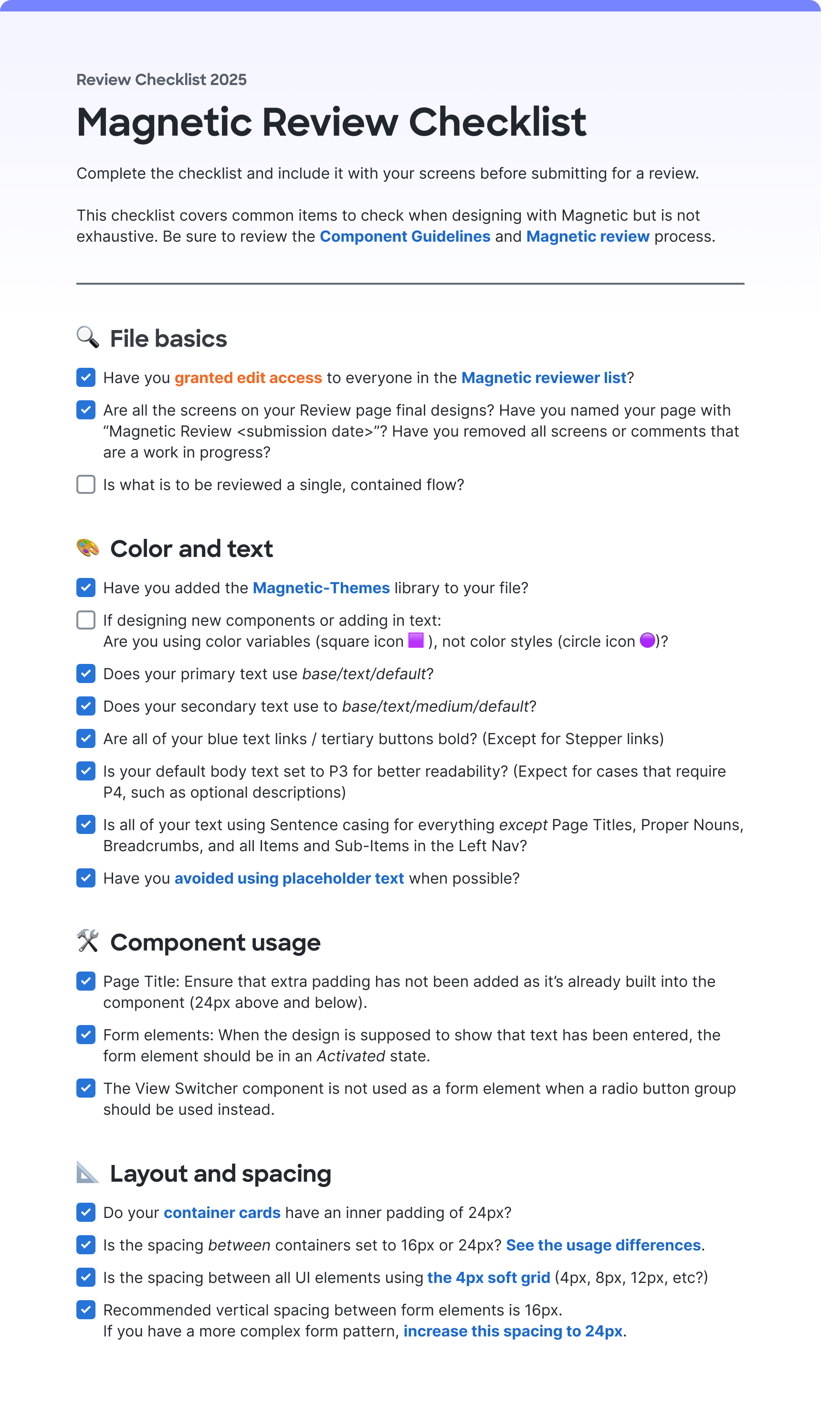
The idea is simple:
Go through the checklist before submitting your design.
But in reality:
- We rush through it
- We miss small things
- Review gets rejected anyway
So even with a checklist, things still slip through.
My Thought: Can AI Do This for Me?
I started wondering:
Instead of manually checking everything… can AI do it?
That’s when I came across something called “Skills.”
Think of Skills like:
- a reusable instruction set
- structured checklist
- something you can trigger without rewriting prompts every time
And the best part — it works with tools like:
- OpenAI
- Claude
(I personally found Claude better because of deeper Figma integration.)
Turning a Checklist into Action
The biggest shift was this:
- Instead of keeping checklist items as questions…
- Convert them into clear action steps
Example
Instead of asking:
“Have you added the Magnetic-Themes library?”
Convert it into:
- Check if Magnetic-Themes library is enabled
- If not → Go to Figma → Assets → Libraries → Enable it
Now it’s:
- clear
- actionable
- verifiable
Another example:
Instead of:
“Are your links bold?”
Convert it into:
- Check all link/tertiary buttons
- Ensure font weight is Bold (700)
- Flag anything that isn’t
Now AI can:
- scan
- detect
- report issues precisely
Structuring the Review
I broke the checklist into 4 main sections:
- File basics (global checks)
- Color and text
- Component usage
- Layout and spacing
Why this matters:
- File basics → checked once
- Others → checked screen by screen
This structure helps AI understand:
- what to scan
- how deep to go
Making It Smarter
I didn’t stop at just the checklist.
I added:
- design tokens
- naming rules
- spacing system
- component rules
Because the checklist alone is just a reference —
AI needs context to be useful.
Testing It
I tested this setup using:
- VS Code
- Claude integration
And honestly… the output was surprisingly good.
It could:
- detect wrong colors
- find spacing issues
- flag incorrect components
- even catch typos
Example Output
MAGNETIC REVIEW — "HA pool" — 15 April 2026
Path A — single frame · Mode 1 (Magnetic checklist)

🎨 Color and Text
❌ Hardcoded hex colors in table cells — not wrapped in CSS variables

#656c75 on table header divider borders — must be var(--control/border/strong/default, #656c75) → 38356:66312, 38356:66313, 38356:66337, 38356:66338, 38356:66339 (+ mirrors in 3rd collapse 38356:67572)
#e1e4e8 on row-separator borders — must be var(--control/border/weak/default, #e1e4e8) → 38356:66342, 38356:66358, 38356:66374, 38356:66390 etc.
⚠️ Sharp Sans Bold used for section headings — Heading/Sub-section title (Sharp Sans Bold 16px/22px) applied to: "New York", "Unassigned", "Assigned to pool", and "Add data gateway instances(s) to pool". The review checklist flags Sharp Sans as a non-Magnetic font. Confirm with DS team whether this named text style is officially sanctioned for sub-section titles → 38356:66284, 38356:66303, 38356:66306, 38356:66331, 38356:67525, 38356:67542, 38356:67545, 38356:67570

⚠️ Content typo — "instances(s)" in two text nodes. Should be "instances" → 38356:66303, 38356:67542

⚠️ "Add another" button — tertiary/link buttons must be Bold (700). Verify the Tertiary button component renders with font-weight: 700. Cannot confirm from Code Connect snippet alone → 38356:66299, 38356:67538

✅ All form labels use Inter SemiBold 14px/20px (P3 SemiBold)
✅ Body and table cell text uses Inter Regular 14px/20px (P3 Regular)
✅ Primary text token — var(--base/text/default) used throughout
✅ Section heading token — var(--base/text/strong/default) used correctly
✅ Placeholder "Value" uses var(--base/text/weak/default) ✅
✅ Sentence casing throughout (proper nouns "Data Gateway", "VIP", "FQDN" treated correctly)
✅ "Add another" uses var(--interact/text/default) ✅

🛠️ Component Usage
❌ Save + Cancel buttons use ⚠ / Button (detached library component) — primary action buttons in the sticky footer bar are detached from the Magnetic Button component set. Replace with clean linked instances → 38101:15412 (Save), 38101:15413 (Cancel)

❌ ⚠ / Table Header visible in both "New York" sections — the component description explicitly says "New version available — update for better features and future updates". While visual parity is maintained, this is a handoff signal to upgrade. Affects 2 visible instances per section (checkbox column header) across 2 identical collapses → 38356:66311, 38356:66336, 38356:67550, 38356:67573

⚠️ Pre-filled "Subnet" input shows value "12" — verify this Input field is using the Activated (or Filled) variant rather than Default. If the variant is Default while content is displayed, that is a violation → 38356:66301, 38356:67540

⚠️ Two identical "New York / Active" sections — the frame contains two parallel collapse sections with identical structure (y=394 and y=1111). Confirm this represents 2 distinct geo sites (intentional) vs. copied duplicate WIP content.

✅ No View Switcher misuse detected
✅ Transfer buttons show Disabled state (bg-[#a3c8ff] = interact/bg/disabled) — intentional when no row is selected ✅
✅ Checkboxes use Default state for unselected rows ✅
✅ "Add another" button correctly uses Tertiary type with leading icon ✅

📐 Layout and Spacing
❌ gap = 40px in Global pool Wrapper — 40px is not on the valid Magnetic spacing scale (1, 2, 4, 6, 8, 10, 12, 16, 24, 28, 32, 36). Use 36px or 32px → 38356:65974

❌ Collapse content padding inconsistent and below 24px — the content area inside each Collapse uses pt-12px / pb-16px / px-16px, which is inconsistent across sides and below the required 24px for standard card containers. If dense mode is intended, all sides should be 12px (uniform). Currently it's neither standard (24px) nor clean dense (12px) → 38356:65617, 38356:66111, 38356:67531

⚠️ Transfer list sub-container p-12px — acceptable only in dense mode. If the page is standard mode, this should be 24px → 38356:66305, 38356:66330, 38356:67544, 38356:67569

✅ Gap between Collapse containers = 24px (correct spacing-600) ✅
✅ Form input column vertical gap = 16px ✅
✅ Row 1 and Row 2 input gaps = 16px ✅
✅ Radio group option gaps = 24px ✅

Summary
Count
❌ Failures	5
⚠️ Warnings	7
Top issues by priority:

⚠ / Button on Save/Cancel footer — detached components on the primary CTA → 38101:15412, 38101:15413
gap=40px off-scale in Global pool form wrapper → 38356:65974
Hardcoded #656c75 / #e1e4e8 hex colors in table cells — unwrapped tokens
Collapse content padding inconsistent (pt-12/pb-16/px-16) — not standard (24px) nor clean dense (12px)
⚠ / Table Header outdated instances in both New York sections
Next steps: Fix ❌ items → clarify dense-mode intent for container padding → raise Sharp Sans heading style question with DS team → run Mode 2 for Foundations + General Checklist review.
What Changed for Me
| Earlier | Now |
|---|---|
| Reviews were slow |
Lots of back and forth
Repeated mistakes
| I catch most issues before submission
Reviews are faster
Feedback is more precise
|
What’s Next
I’m planning to take this further:
- Turn this into a bot (maybe Webex)
- Let designers run reviews themselves
- Reduce dependency on manual review cycles
Final Thought
This isn’t about replacing design reviews.
It’s about:
removing repetitive mistakes so reviews can focus on real design quality
If AI can handle the checklist…
we can focus on better design decisions.