Designing with limited Input, using ChatGPT

Table of Contents
Introduction #
The ability to design with limited input is a highly valued skill for UX designers. Although it may sound controversial, this is increasingly the case in many companies today. Tech companies often prefer designers with technical backgrounds who can quickly pick up projects with minimal guidance.
The days when a subject matter expert was readily available on every team to answer questions are largely gone. It’s crucial for designers to create their own learning paths and seek out the answers they need. Thankfully, tools like ChatGPT speed up our research, allowing us to get our questions answered quickly. Let’s explore an example of how we can tackle an ambiguous request with the help of ChatGPT.
Example Request #
Recently, I received an interesting request from a team: “We want to show the latency, jitter, and delay for the devices.” Along with this request, they provided a JSON file containing raw data for these metrics.
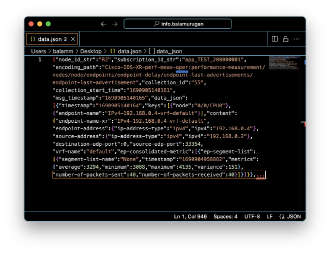
To give you some context, the product I work on is a network management tool that controls all the routers within a network. The metrics mentioned—latency, jitter, and delay—are key indicators of the network’s traffic flow.
However, I wasn’t entirely familiar with this specific data. So, I decided to leverage ChatGPT. I simply pasted the JSON into ChatGPT and asked for a summary.
In no time, ChatGPT provided a detailed explanation of the data. It turned out to be telemetry data collected from a Cisco IOS XR device, complete with descriptions of each parameter.

This process gave me a much clearer understanding of the metrics. But I wanted to dig deeper and understand how these metrics were calculated. After spending about 30 minutes researching, I was able to gather a lot of useful information. Here are the notes I took during this time:
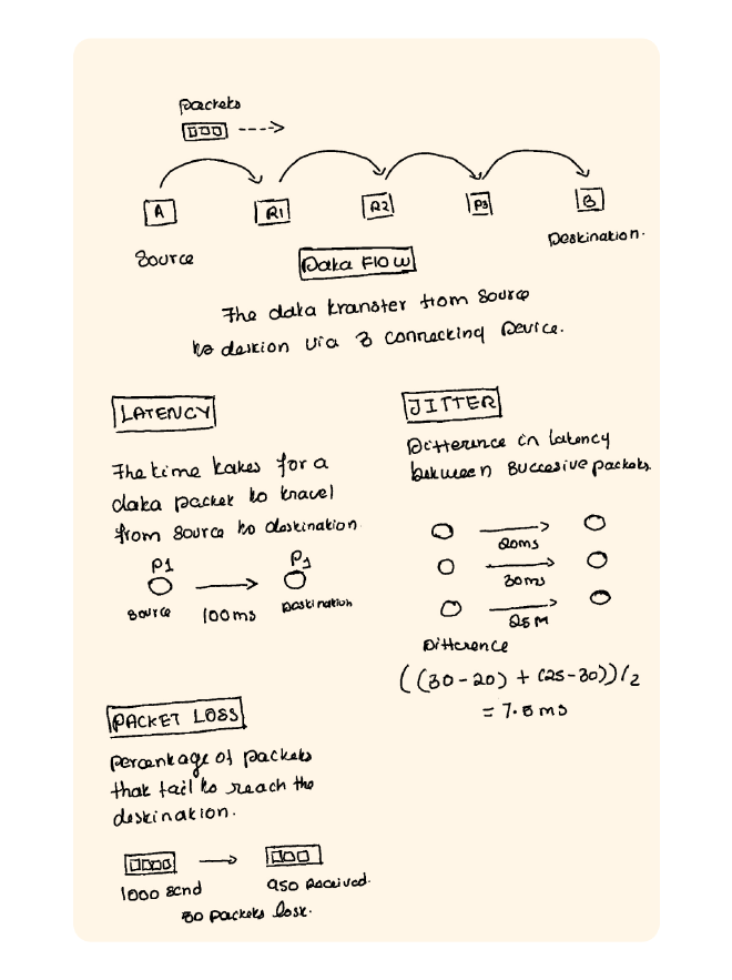
With a solid understanding in hand, it was time to move on to the design phase. My goal was to display the key metrics prominently at the top of the main screen.

These 4 metrics are crucial for the user. For the delay metric, I included additional values like average, minimum, and maximum, calculated for each session. I ensured that each metric displayed the corresponding value and unit, closely matching the actual data.
The next important visual element I focused on was displaying metric values over a period of time. Among the four metrics, delay is particularly significant. I created a graph that tracks each entry, with jitter, packet loss, and throughput displayed on hover.
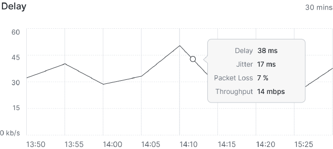
I used ChatGPT to help generate values that closely resemble the actual data, ensuring accuracy in the visuals.
Another critical visual was showing the frequency of jitter across various ranges. This information could be invaluable to users, allowing them to take action if a particular range shows unusual repetition.
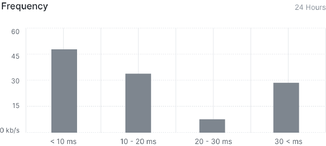
The final visual component was to illustrate the data transfer path. All the metrics I’ve calculated so far are cumulative values for all the devices along this path. Breaking down these values helps identify any malfunctioning devices, making it easier to take corrective action.
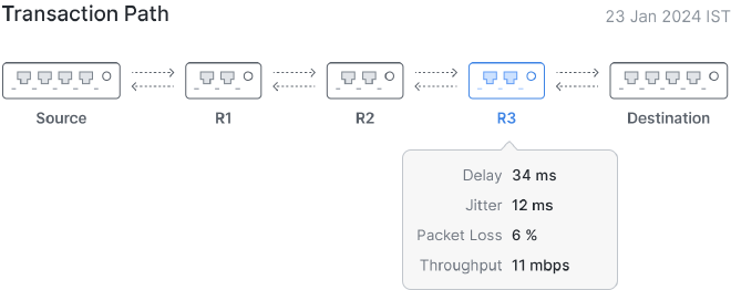
On hover, users can see all the metrics for each specific device. Here’s the final design, incorporating all these elements:
<— Design Blocks —>
After completing the design, I tested it with three network engineers at Cisco. One engineer asked, “How would users know which sessions are active and which are completed?” After checking with the developers, I found that we were only displaying active sessions, with completed sessions not shown. To address this, I decided to title the section as “Live Sessions” and display the duration for each session.
Another key question was, “Is there a way to view all live sessions on one page instead of navigating to individual devices?” This feedback made sense, so I created a new page where all sessions are displayed, highlighting the path in the topology map on the left.
<— Design Blocks —>
The final question was whether it was possible to plot jitter on the graph, as it would help identify glitches at specific times and aid in root cause analysis.
The rest of the design was well-received, and with this feedback, I finalized the design within 15 days—conducting my own research and testing with limited support.